

DIGITAL GALLERY
Identity • Illustration • Applied Design
From personal identity to commissioned design, this gallery traces the evolution of iMage through digital illustration, typography, promotional artwork and visual branding.
Some works begin with traditional drawing and are developed digitally; others are conceived specifically for commercial, promotional or identity-based applications. Together, they document an ongoing process of transforming ideas into distinct visual forms.
THE ARCHIVE BEGINS WITH IDENTITY


IDENTITY & BRAND EVOLUTION
The mark changes. The identity remains.

iMage - Current Brand Mark
The current iMage logo presents the brand through ornate custom
lettering, luminous blue-violet forms and gold-edged detail,
establishing a distinctive contemporary identity.

iMage - Mysticism & Duality Mark
A gothic-inspired iMage wordmark built around sharp serifs, flowing curves and a stylized yin-yang-like eye. Purple, yellow
and black reinforce themes of duality, balance and transformation central to the brand's creative philosophy.

iMage - Early Overlapping Wordmark
An early iMage identity study using overlapping letterforms against
a radiant purple, magenta, orange and yellow field. The design
emphasizes motion, ambition and the evolving visual voice of the
brand.

Family-Rooted M/L Concept Mark
A geometric M/L monogram split across contrasting color fields, with a nested green letterform joining the two sides. A
playful early identity experiment centered on balance, growth and connection.
DIGITAL TRANSFORMATION & APPLIED ILLUSTRATION
Traditional marks enter a digital second life.
i, The Witchfinder - Digital Color Study
A digitally colored 2025 treatment developing the original linework
through turquoise, violet, gold and black. A skull-faced central
figure, coiling serpents and horned skeletal forms create a dense
occult-fantasy composition while preserving the underlying drawn
structure.


Fallen Leaves - Digital Oil Treatment
A digitally transformed treatment of the Fallen Leaves composition,
intensifying its fluorescent botanical palette with a textured, oil-like
surface. The result demonstrates how an existing traditional image
can be reinterpreted through digital finishing without changing its
core composition.
Synth Freedom - The Face of New World Order
A poster-like digital presentation built around the phrase 'SYNTH FREEDOM' and a split human-machine face. Saturated blue,
magenta and white create a deliberately graphic,
propaganda-poster aesthetic centered on technology, identity and
the language of a 'new world order.'
* Based on the Game series Fallout


Suicidal Witchdoctor - Esham Tour Flyer
The black-and-white version of Suicidal Witchdoctor won a 2017
contest and was used as the official tour flyer for Esham's
'Can't Nibble the Scribble' tour, demonstrating the artwork in a real promotional context.

Known Demons - Cover Artwork
A dark narrative cover depicting chaos within a broken home, with the artist Known portrayed in a personal refuge while writing lyrics.
Photoshop enhancement and custom Illustrator typography complete the presentation.
CLIENT LOGOS & COMMERCIAL IDENTITY
Symbols built to be remembered.
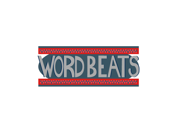
Wordbeats - Concept Logo
A concept identity for a copywriting firm, using monumental typography reminiscent of ancient Roman architectural forms.
Designed in Adobe Illustrator.

Things - Smoke Shop Logo
A playful identity created for the now-closed Things smoke shop in Fredericton, New Brunswick.
A chameleon exhales
smoke rings while the business name is integrated into its body; created in Adobe Illustrator.
SICK - Music Logo
A bold identity for SICK
(Sick Insane Corrupted Klick),
a Detroit rap project.
A serpent's eye is embedded within the
custom lettering, giving the mark an aggressive, immediately recognizable focal point.


Canadian Compassion Club - Logo
An identity for an online dispensary in British Columbia, combining the medical caduceus with Canadian maple and
cannabis leaves.
Created in Adobe Illustrator.
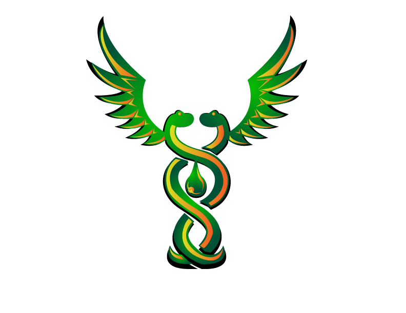
Canadian Compassion Club -
Serpentine Caduceus Variant
A mirrored-serpent emblem inspired by the caduceus, with wings suggesting elevation and freedom and a central droplet
referencing therapeutic cannabis concentrate. The composition blends ancient medical symbolism with modern cannabis
branding.
Paradox Prints - Logo
A circular identity for Paradox Prints centered on a black-hole-like spiral and encircled by the brand name. Designed in
Adobe Illustrator to communicate creativity, motion and visual depth.

KantMissEnt - Custom Typography
Custom typography developed for a Detroit rapper's various brands. Multiple letterform treatments demonstrate adaptable
identity design tailored to different applications while maintaining a distinctive visual character.
FROM VISION INTO FORM
Every identity begins as an idea. The work is giving that idea a form people can recognize, remember and make their own.
iMage develops distinctive visual work across illustration, logo design, custom typography, promotional artwork and
creative identity - built around the individual character of each project rather than a predetermined template.
